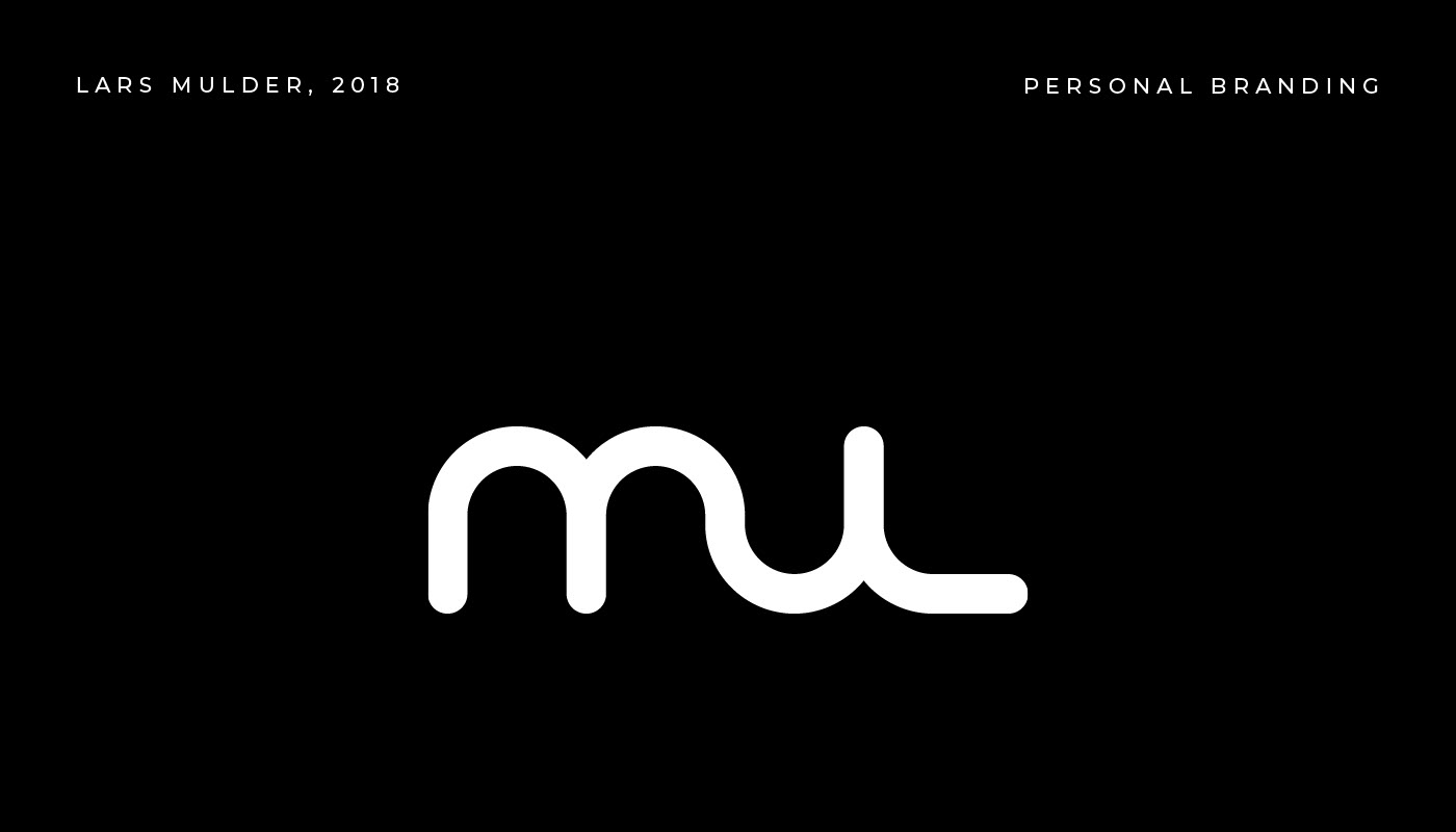
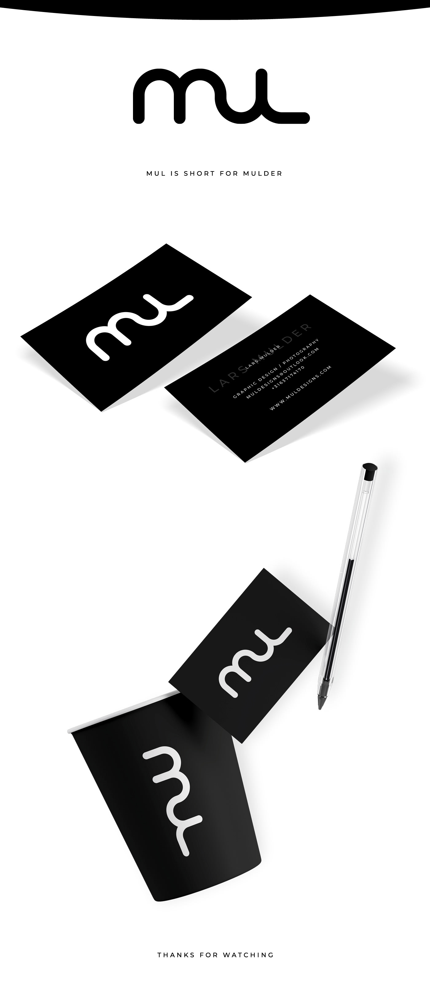
Personal Branding - Mul
You may also like
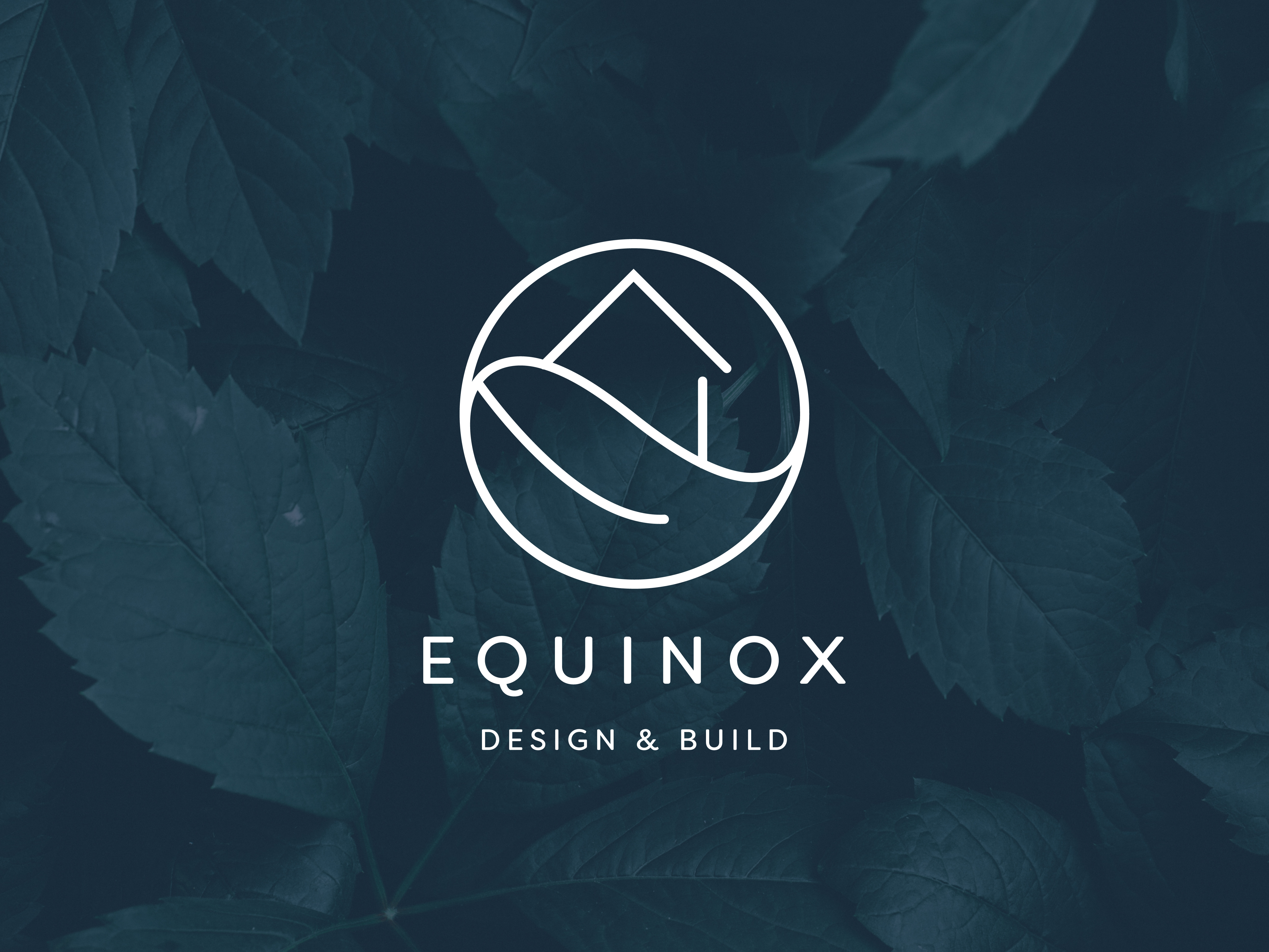
Equinox Services
2019
Everyday Photography
2020
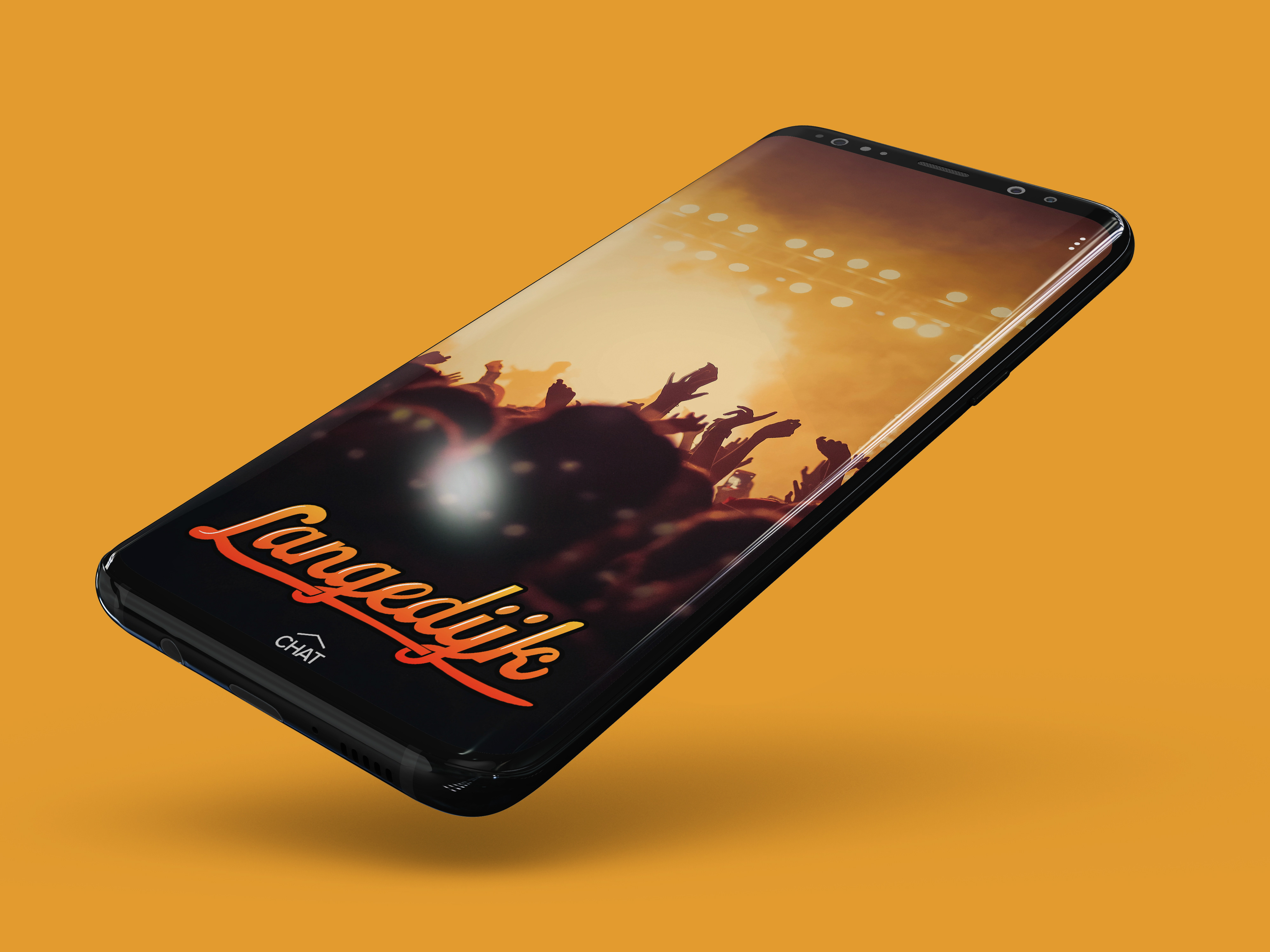
Snapchat Geofilter for Langedijk
2018
Joe!
2018
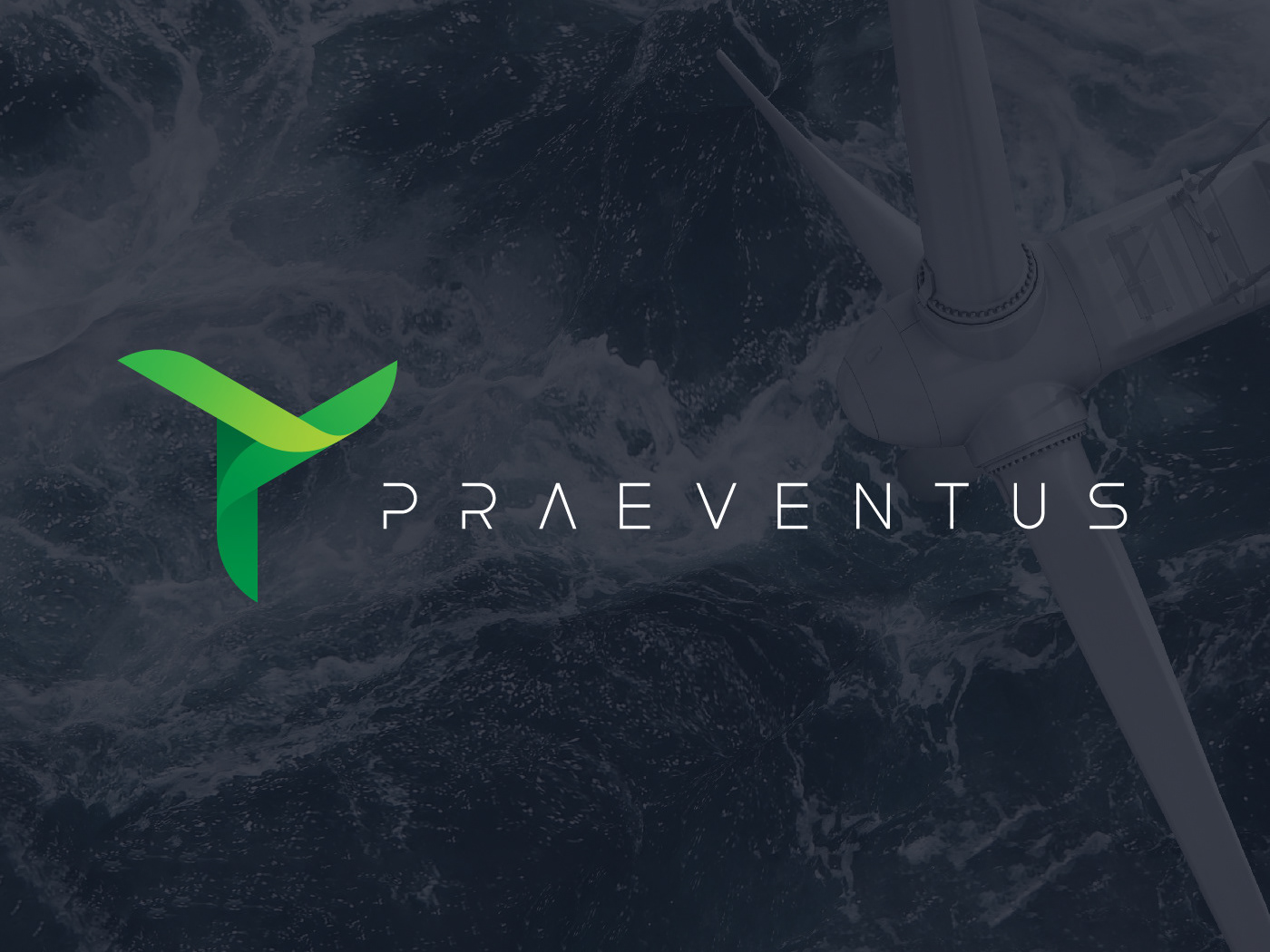
Praeventus
2021
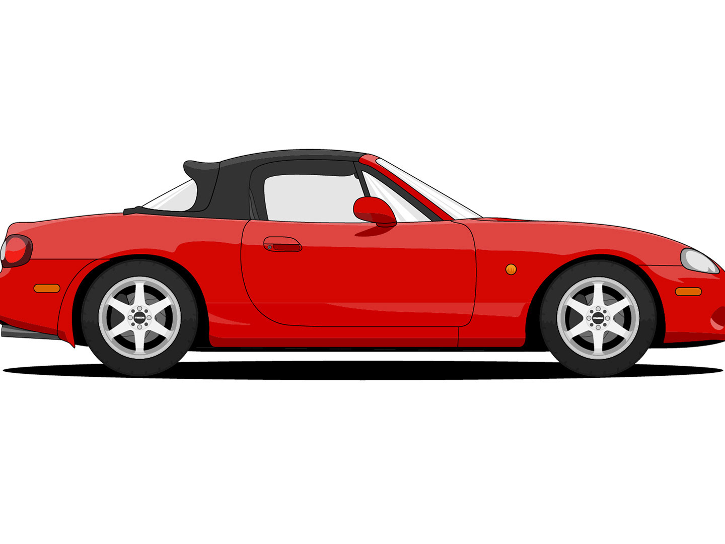
Mazda MX-5 Illustration
2019
Logofolio 01
2020
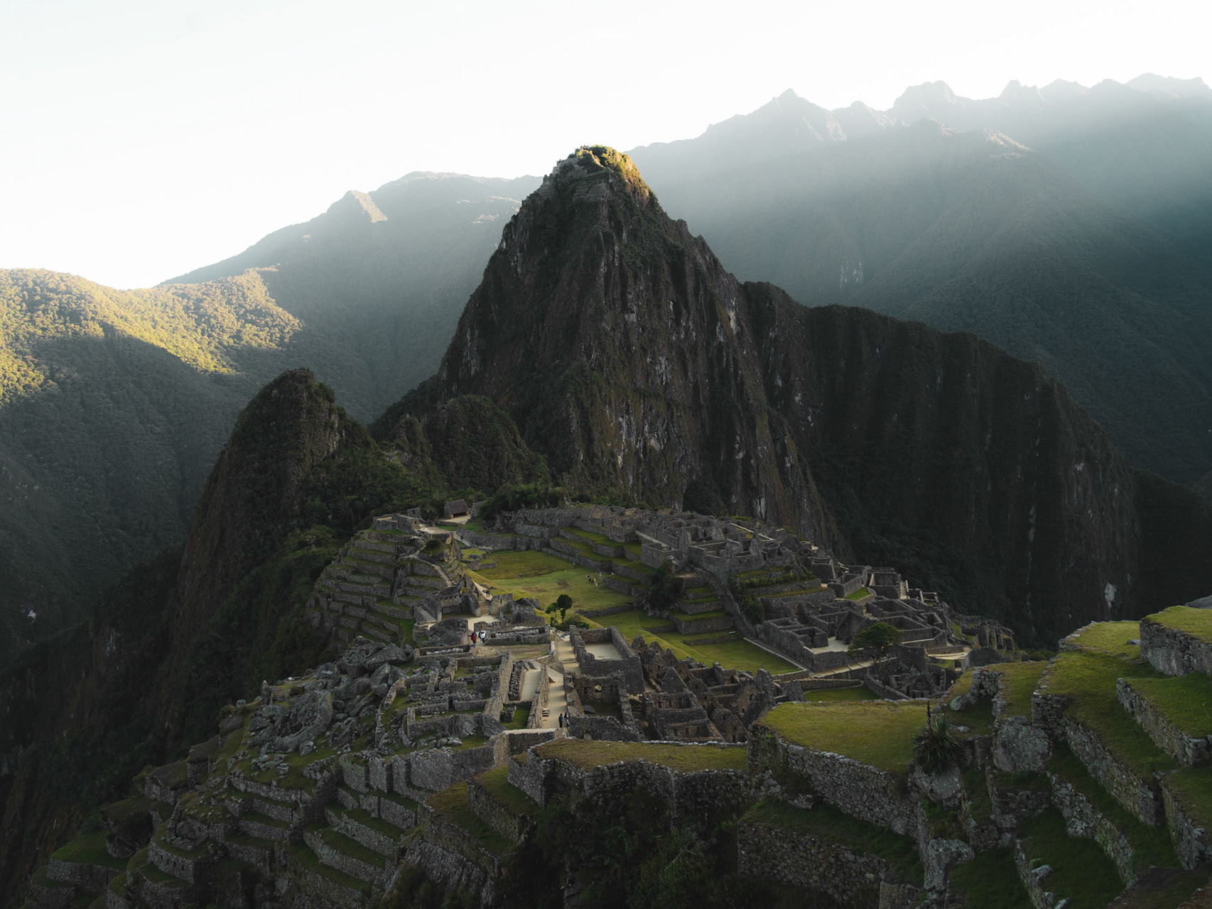
Street / Nature Photography
2021
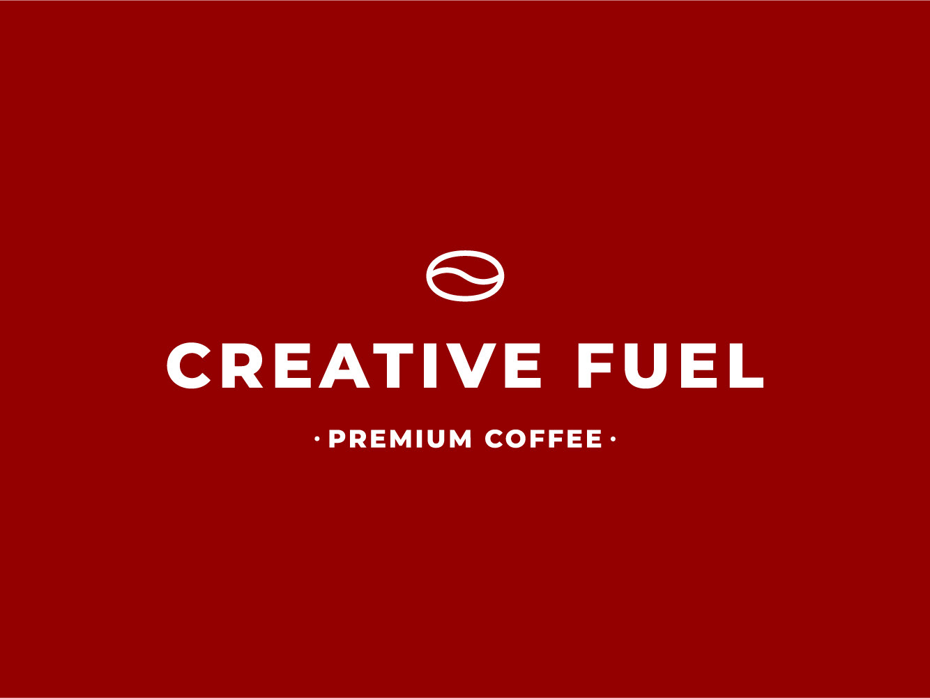
Creative Fuel
2018
↑
Back to Top